Thanks for reading our blog! Now we invite you to watch a demonstration of our finished product.
Developing an app to facilitate blood pressure monitoring for hospital patients
Thanks for reading our blog! Now we invite you to watch a demonstration of our finished product.
Posted in Uncategorized

This diagram shows the way functions are organized to present streamlined flow through the app for various use cases.
-LM
Posted in Uncategorized
Visibility of System status
The BPM app is quite simple. At each screen the number of actions that the user can take is always quite limited. For this reason we didn’t feel that adding a navigation indicator for the user was a high priority.
We do feel that providing app navigation feedback to the user is a feature that would make enhance the user experience. App navigation would give the user immediate feedback on their position within the apps navigation, and so would provide the user with confidence and reassurance.
However, we did include a system status indicator when the user is pairing the device running the BPM app with a bluetooth BP cuff. Bluetooth pairing can fail due to reasons that are not visible or obvious to the user. Further, bluetooth pairing is a critical step in using one of the modes that the BPM app provides the user, the Ambulatory BPM (ABPM) mode, as this mode should automatically take measurements from the bluetooth BP cuff via the bluetooth connection. For that reason we have tried to provide the user with feedback for all the scenarios where bluetooth pairing could fail so that the user can quickly and independently resolve the problem.
Match between system and real world
Systolic / Diastolic
Real world representation of blood pressure (BP) is typically described as ‘systolic pressure / diastolic pressure’. In the BP app we tried to continue this representation. In the BPM app where the user enters values for systolic and diastolic BPs we tried to reflect this visually by placing the field for systolic BP in the upper left relative to the diastolic BP field in the lower right (relative to the systolic field).
Maintaining consistency with current paper based report
One of the key aims of the BPM app was to represent the user’s BP measurements as closely as possible to how a Doctor would currently receive a BP report for their users. The current format is an A4 size document and comprises (1) a summary report of the BP measurements, (2) a graph plot of the measurements and (3) a table of all the measurements and values that are used to generate the summary report and graph plot.
In the BPM app we tried to maintain this format so that the format of the report that the user sends to their Doctor is consistent with what the Doctor currently receives. To that end we designed the report that the BPM app generates to visually be as similar as possible to the current paper based representation.
User control and freedom
We designed the BPM app to give the user a large amount of control over the data that they enter into the app. This was for 2 principal reasons.
Free of mistakes
Firstly, we thought it was very likely that data input to the user either manually or automatically via the bluetooth cuff would be incorrect, perhaps due to mistakes by the user or perhaps because the bluetooth cuff has not been correctly fitted on the users arm.
As a result we have tried to design the BPM app so that the user is easily able to alter the values they have input. For example, when the user is manually inputting values to the BPM app the time field by default contains the current system time, but the user is able to alter this manually. We thought this functionality would account for a use case where the user took their BP measurement at an earlier time but was delayed in inputting these values into the app.
Free control of personal health data
Secondly, we thought that users would feel very uncomfortable if they didn’t have complete control over the data that they input to the app. Data privacy relating to personal health is an issue that is a frequent topic of debate in the media, and in the design of the BP app we wanted to allow the user to easily control the data that the app contains.
For this reason we have tried to design the BPM to allow the user to easily delete measurements that they have input to the app.
Consistency and standards
Conforming with IEEE standards for personal health device communication
A key part of the the BPM design brief was that the app should be able to wirelessly communicate with an as yet unspecified bluetooth BP cuff. In order to ensure that this is the case we used the following IEEE standards to design the BPM apps bluetooth data interface:
ISO/IEC/IEEE Health informatics–Personal health device communication–Part 20601: Application profile–Optimized exchange protocol
( http://ieeexplore.ieee.org/stamp/stamp.jsp?tp=&arnumber=5703195&isnumber=5703194)
11073-10407-2010 – ISO/IEEE Health informatics Personal health device communication Part 10407: Device specialization Blood pressure monitor
(http://ieeexplore.ieee.org/stamp/stamp.jsp?tp=&arnumber=5682320&isnumber=5682319)
We hope that this will give the BPM app the greatest possible compatibility with bluetooth enabled BP cuffs.
Error prevention
The BPM app relies on getting correct values for the BP measurements. To ensure that the data that the BPM app uses to generate a report for the Doctor we designed the app with the following features:
Flexibility and efficiency of use
We have tried to ensure that the design of the BPM app matches the widest possible range of use cases.
For this reason we have tried to ensure that the app provides a user experience that is both simple and efficient. For example, we have tried to design the user workflow so that at each screen the user number of choices the user has is limited, but that the navigation is logical and intuitive.
We hope that this will mean that in a use case where the user only has a basic level of technical confidence and ability and they are able to simply and efficiently make use of the app.
Conversely we have tried to design the app so that for users who have more technical confidence and are interested in the data that the BPM app generates that they are able to simply and flexibly create and view reports based on their personal health data.
Aesthetic and minimalist design
As mentioned previously, we have tried to ensure that the design of the BPM app is simple and efficient. We envisage that much of user’s interaction with the BPM app will be for very short periods of time where they are simply using the app to input data. To that end, we have tried to ensure that the the aesthetic of the app does not distract the user from this use case.
Helping the user recognise, diagnose and recover from errors
As mentioned above we have been very conscious in the BPM app design that the user should be able to easily input data to the app and that this data is a valid representation of the users true BP.
As a result we have tried to design the app so that in cases where invalid data is input to the app that the user is informed why the data is invalid together with action that they can take to ensure the input data is valid. Similarly we have tried to ensure that in cases where the bluetooth connection with the app fails that the user is informed of the reason for this together with action they can take to resolve the problem.
Help and documentation
We have tried to make the BPM app as self describing as possible. For example, when the user selects between using either the HBPM or ABPM modes the next screen the user is presented with explains what actions the user needs to take in order to use these modes. When the user selects the ABPM mode the next screen explains that this mode requires a bluetooth BP cuff. Conversely, when the user selects the HBPM mode then the next screen explains that this mode requires a separate BP cuff that the user should use to determine the BP measurements before manually inputting them into the app.
In addition, and as mentioned previously, the we have tried to ensure that when the user is pairing the BPM app with a bluetooth device and the pairing fails then the user is informed of this and what action they can take to resolve the problem.
NBH
Posted in Uncategorized
As described in the previous blog entry, Norman’s principles of usability apply to our main user interface module. That is the main component of our app that embodies these principles; however, these principles can also be seen in the Bluetooth interface module, which has one UI screen, written by Kyle.
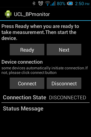
Though it is one screen, it demonstrates aspects of visibility, feedback and affordance. This screen helps with visibility, because it lets the user know what the state of the app is: in the Connection State field, for example, the user immediately knows if their Bluetooth-capable device is communicating with the app. The status message gives the user feedback- did their efforts to connect to the device work? Buttons are labeled with clear, easily recognized labels to suggest what they do, achieving the goal of affordance.
The analyzer module has no interface with the user, as it is a lower-level component. It supports the functions of the UI by processing data.
-LM
Posted in Uncategorized
Donald Norman is one of the founding figures in the field of interaction design and usability. His most famous book is “The Design of Everyday Things” and it outlines several key concepts for understanding and designing good user interfaces. Our app was designed with these concepts of feedback, constraints, consistency, visibility, affordance, and mapping in mind.
Feedback is important for a user’s interaction with the app. We have implemented feedback in many screens of the app. For example, in the Login screen, the user is required to either be registering for the first time, or enter a username and password that has been stored in the database. If they enter a username that is not correct, they get an alert telling them that they need a better username. If it’s the wrong password, the alert specifies that. There are some informational screens that the user can select as well, such as when the app asks them if they have hypertension. If they click the “yes” button, the app immediately warns them that it might not be suitable for them. In the TimeFrame page, the time of the user’s blood pressure measurement is reported back to them, allowing them to review the time they have submitted.
Constraints are useful in order to narrow down the possibilities of use, so that the user can focus on what is achievable. By using time and date spinners instead of EditTexts for time and date entry, we ensure that the input is in proper, app-usable, format. Also we tried to keep the option choices down to two per screen. This way the user is not overwhelmed, and the possible workflows through the app are more clear.
This app echoes the mechanics of other known apps in order to maintain consistency, which allows the user to predict the mechanisms of the app based on their similarity to other apps. For example, a field with a line under it and a blinking cursor indicates that it is meant to be filled out (an EditText). Our buttons are rectangular and labeled with an action or a question, indicating to the user that they can indeed expect these to have button functionality. This consistency is maintained within our app as well.
Visibility is the concept of communicating to the user what is happening inside the app. They should know roughly what is going on, even if they are not directly involved in that process, if it is relevant for them to know (they wouldn’t necessarily need to see every database call, for example). In our app, we actually intentionally restricted visibility in some areas in order to achieve our aims. We don’t tell the user that there are several screens of registration, for example, in order to entice them to be more likely to finish each screen, in the way that a personal trainer might tell you “five more minutes” twice: to make your work out at your maximum rate for ten minutes!
Affordance is achieved by making the appearance of tools match their possible actions, such as having a kettle with a visible spout, to use a real-world example. An example in our app would be a time spinner, which reminds one of an old-fashioned alarm clock, indicating that the time can be changed by scrolling.
Managing user expectations is one of the core principles of interaction design; one way this can be achieved is through mapping. An example of mapping in our app is that when the user enters their blood pressure, the systolic value is to be entered to the left and slightly higher than the entry field for the diastolic value. This is similar to the way blood pressure is normally expressed, as in “your blood pressure is 120 (systolic) over 80 (diastolic).” To further back this up, the fields are labelled, and even a hint is given to the user: “Enter systolic (larger number)”. This makes this key entry field very clear to the user.
-LM
Posted in Design
Screen orientations
We envisage the greatest market for our app will be smart phones. This is for a number of reasons.
Firstly we think smart phones are most likely to be the device that users have. This is because in one device and purchase a smart phone gives the user a range of core functionality: it provides a device that the can be used as a telephone, web browser, and app platform.
Secondly, we feel that a smart phone will be a popular device to use in combination with the BPM app. This is because their small size will give the user the convenience and freedom to take their blood pressure (BP) at any time during their daily routine.
A key part of designing the BPM app for a smart phone platform has been to ensure that the app’s user interface orientates to match the orientation of the device. We feel that users could want or need to use the BPM app in many different environments and with their smart phone in either horizontal or vertical orientations. As a result we felt that it was really important to ensure that the orientation of the BPM app matched the orientation of the phone. We felt that not doing so would result in a user experience that was both confusing and frustrating.
The BPM app makes use of the Android platform’s XML layout attributes to ensure that the BPM app user interface can respond to the orientation of the host device to maintain a high quality user experience.
Responsive design
The BPM app has intentionally not been designed to behave differently on different device sizes. This is choice is based on a few significant reasons.
Firstly, the BPM app user workflow is very fixed and limited. The most significant interaction that the user will have with the app is when BP measurements need to be input. This is a process that has only a few steps, also it is a process that is likely to be completed within a few minutes. We can not see how adjusting the app design for larger screen sizes would improve the user experience.
Secondly, the BPM app user interface has been designed to be very simple. This is so that users with only basic technical confidence and ability are able to very simply navigate the app. Indeed, we have intentionally designed the work flow so that at each screen the user the number of choices that the user is presented with is always limited.
We feel that altering this design to take advantage of the screen sizes and resolutions on larger devices could risk creating confusion for in the user experience.
Lastly, keeping the BPM user interface static across screen resolutions could actually be a benefit. Some users might intentionally use devices with higher display properties because they find using smaller devices difficult. In such cases the BPM app would respond well to their need. Its static design would scale up to these larger screen properties and satisfy those users requirements.
We intentionally made use of the Android platform’s ‘density independent pixel’ units to allow the BPM app’s user interface to provide a constant user experience independent of the host devices physical properties.
NBH
Posted in Uncategorized
During our app design we were very conscious of our user scenarios. With those in mind we tried to incorporate the following features in to our design:
User privacy
People’s health can often be a very private matter. However people often use their mobile devices in a public manner. Parents might give their children their tablets to play games on, an elderly couple might share use of a tablet, a teenaged user might use their device to show something to their friends. We wanted to ensure that users of the BPM app would be able to keep their data secure, without having to worry about having to keep their actual devices secure.
For this reason use of the app requires the user to register with a username and password. This allows multiple users to use the app on the same device but without being able to access the other’s data.
Clinical relevance and user freedom
A user’s blood pressure could be outside the normal range for a number of different reasons. As a result, the more clinically relevant data that the Doctor is able to access then the more information the Doctor has available to base their diagnosis on. However, users may feel uncomfortable about disclosing this information or not easily be able to determine it (e.g. height and weight).
As a result, on setting up a user account the BPM app allows the user to input this information but does not prevent them from using the app if they do not wish to do so.
View a report from previous measurements
An individual’s health can often be a very private matter, but we also thought that users would also be really interested in their health data, and want to be able to easily and flexibly review it.
For this reason, after passing the login screen the user is able to choose to either (1) begin a new measurement or (2) to immediately view a report of previous measurements. The user is then able to give any time range of measurements from which to generate a summary report and graph.
ABPM vs HBPM
One of the principal functions of the Blood Pressure Monitoring (BPM) app is that it works in two modes, depending on whether the user has access to a compatible bluetooth BP cuff. The first mode is an ‘automatic’ mode and this requires a bluetooth BP cuff. The clinical term for this is
Ambulatory BPM (ABPM). The second mode does not require a bluetooth BP cuff, and the clinical term for this is Home BPM (HBPM).
As a result, after the user has chosen to start a new measurement the user is next able to choose between the 2 modes.
Full support for bluetooth dis/connectivity
Pairing a device with bluetooth can fail due to reasons that are not obvious to the user. For users who have a basic level of technical knowledge and ability it can be particularly difficult to understand why bluetooth connectivity is failing. This can cause the user to become disengaged from the app and would result in them missing out on a major aspect of the BPM app’s functionality.
For this reason we have tried to ensure that for all of the cases where bluetooth connectivity can fail then the user is given the necessary information they need to resolve the connectivity, and that this information is given clearly and simply.
Simple dispatch of summary report and data to the Doctor
A final key feature of the BPM app is that it allows the user to create a summary report and send it remotely to the Doctor. This is in contrast to how BP is currently measured outside of a Doctor’s appointment which involves travelling to collect and return a BP advice (usually a hospital) and waiting for the measurements to be sent on to the Doctor.
To provide a solution to this time and expense that is currently required, our app allows the user to generate choose a time range of measurements and at the click of a button generate a summary report and graph for those measurements, store these in a PDF file, and open the devices email client and create a new email to the Doctor with the PDF file attached.
NBH
Posted in Uncategorized
We know a number of simple facts about our users:
From this we can construct a few simple user scenarios:
Marge
Background:
Female, busy mother of three young children.
Marge has recently been feeling unwell. At a recent Doctor’s appointment Marge explains that her son and husband have been causing her to be very stressed. Her Doctor thinks that Marge may be suffering from a high blood pressure. Marge’s Doctor asks Marge to download and use the BPM app, and also issues Marge a bluetooth enabled Blood Pressure (BP) cuff to use with it.
User technical ability and BPM mode choice:
Marge’s level of technical ability is sufficient for her to independently use the BPM app. The BPM app has two modes that Marge can choose from. An automated ‘ambulatory blood pressure monitoring’ (ABPM) mode and a manual ‘home blood pressure monitoring’ (HBPM) mode.
Most of Marge’s day is spent undertaking house chores, together with caring for her three young children. She does not want to spend time taking manual BP measurements in the HBPM mode. She instead decides to use the automated ABPM mode. This requires that Marge wear the bluetooth BP cuff continuously for 24 hours.
User Experience:
The ABPM mode requires Marge to pair the bluetooth BP cuff with her mobile device on which she is running the BPM app. Marge finds the process to be straightforward and successfully begins the ABPM recording. During the night Marge’s husband causes the BP cuff to become dislodged. During this time the measurements sent from the BP cuff to the BPM device are below the permitted threshold and so are not recorded. The next morning Marge reconnects the bluetooth BP cuff to the BPM app and completes the 24 hours of BP recordings. She uses the BPM apps ‘email report’ function to send the report to her Doctor.
Lisa
Background:
Young school girl, passionate about education, learning and science.
Lisa recently visited her Doctor for a routine checkup. Lisa’s Doctor takes her blood pressure and finds it to be above the normal range, and so issues Lisa a bluetooth BP cuff and asks her to download the BPM app to use with it.
Lisa suspects that the BP measured by her Doctor may be unusually high as she is very worried about a science test that she has tomorrow at school. But she is very excited at the chance to measure her own blood pressure so takes the BP cuff and downloads the BPM app.
User technical ability and BPM mode choice:
Lisa is very technically literate and really wants to use the BPM app’s ABPM mode. However she knows that wearing the device at school will bring too much attention at school. As a result she decides to use the app’s HBPM mode. This allows her to measure her BP at home in the morning and evening and manually record the readings in the BPM app.
User Experience:
Lisa uses the BP cuff without its bluetooth connectivity. She is able to do this in the privacy of her own room. She is very excited to record her own BP, and does so twice a day over the next 5 days. She takes a screen capture of the graph and summary report of the BP measurements and uploads them to her blog. She then emails the report to her Doctor, who emails back to inform Lisa that the HBPM data shows that her BP was normal.
NBH
Posted in Uncategorized
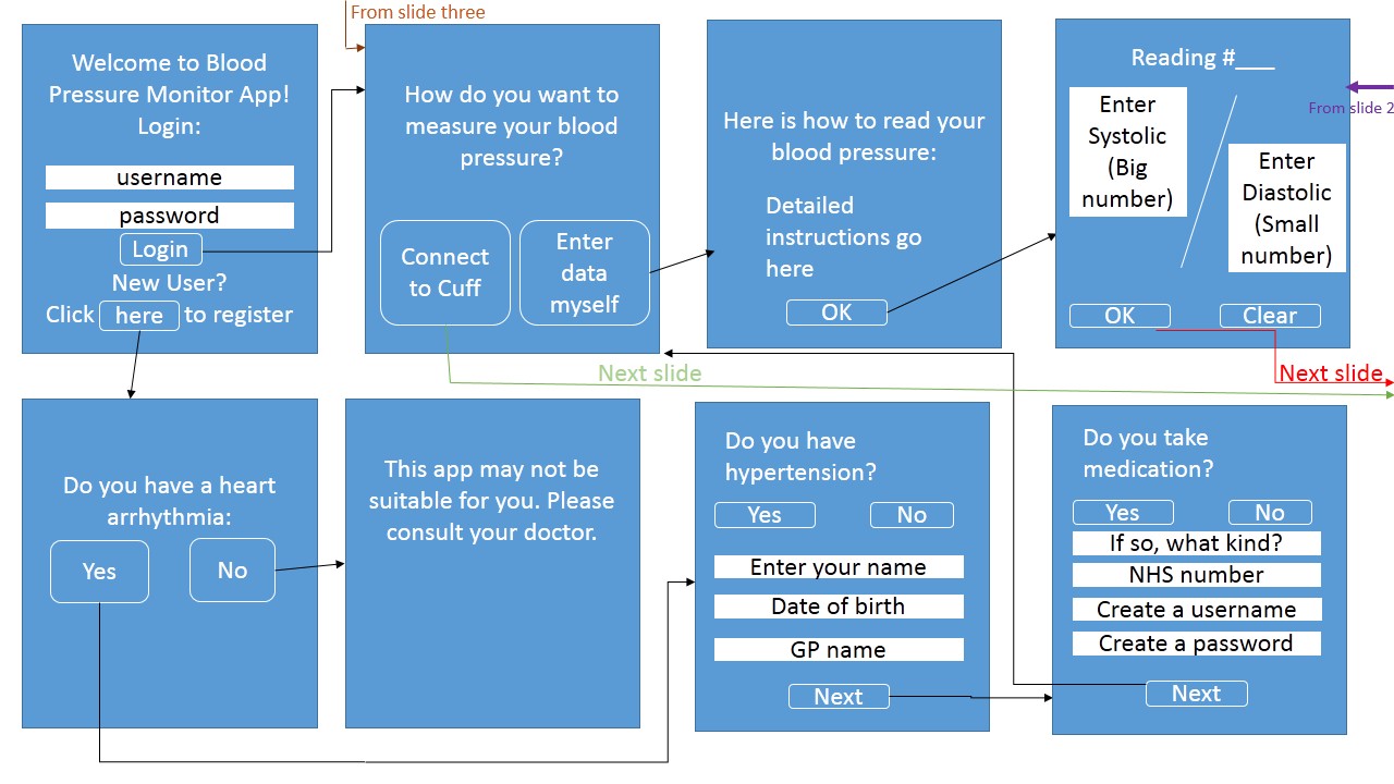


An important part of app design is deciding which screens should appear, and designing the flow of control between them. In the above flow diagram, you can see how we have visualized our app.
-LM
Posted in Flow Diagram
Welcome to Apps Team 35’s HCI blog. In this blog, we will explore issues of Human-Computer Interaction as they relate to the creation of a blood pressure monitoring app. This project is part of a Computer Science Design course at UCL.
If you have any questions, please contact us at appteam35@gmail.com.
Thanks for reading!
Posted in Uncategorized
